Difference in Navigation Drawers in Google Apps?

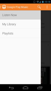
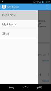
Google recently started adding a Navigation Drawers in most of it’s apps: This trend has started to catch on with many third-party app makers as well.

But there are some differences in these Navigation Drawers, and I wish Google would sort it out. It’s driving me crazy!

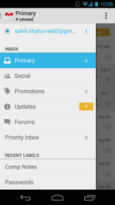
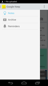
If you notice, even the sizes of the panes are different in each case! Very inconsistent.

What do YOU think? Let me know in the comments!
The "Google Play Apps" all look similar. But these buttons are very large compared to normal SlidingPanes.

The “Google Play” apps all look similar. But these buttons are very large compared to normal Navigation Drawers.
The "Google Play Apps" all look similar. But these buttons are very large compared to normal SlidingPanes.

The “Google Play Apps” all look similar. But these buttons are very large compared to normal Navigation Drawers.
This seems relatively consistent with Keep.

This seems relatively consistent with Keep.

This seems like the ideal size. But that white space is killing me. I can't think of another solution, though...

This seems like the ideal size. But that white space is killing me. I can’t think of another solution, though…

It looks consistent with the web version (thank god) but it feels too congested on Android.

It looks consistent with the web version (thank god) but it feels too congested on Android.

Got something to say?