So this rant pertains only to a couple things about the Camera experience on stock Android.
We all know that the stock Camera app is a pain. These are a couple more details worth noting:
First up, the lockscreen. In <4.3, you could access the camera by swiping to the left on your lockscreen. The indication to swipe, however, was fairly weak, so I assume they decided to add an icon to make it more obvious, like iOS.

Android 4.2 Lockscreen widgets & camera
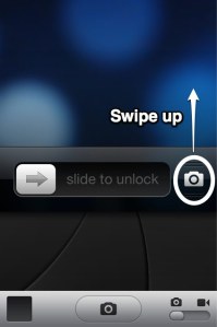
iOS Lockscreen – Sorry for the old iOS image. *shudders*
The problem here is, on iOS, you’d hold the camera icon and swipe up with it, revealing the Camera viewfinder. On Android, the icon is placed lower than where the viewfinder’s image shows up, so it feels very odd and non-intuitive.
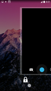
Android 4.4 Lockscreen. The white dot is my finger.
It’s a little hard for me to explain – you’ll have to try this out for yourself. Your finger is sliding under the image of the viewfinder. It’s just wrong.
Next, in the Photos app (comes annoyingly bundled with Google Plus), I don’t understand why the icons need to disappear and reappear for each damn image!

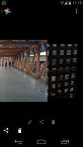
Instead, the icons can be kept constant, as the image changes.
As before, you’ll have to experience it yourself to get it.
Anyways, that’s enough for today. What do you think? How do you like the Stock Android Camera experience?


