[FIXED] Google+ icon enlarged?

[UPDATE]

Looks like Google fixed it!

Yay!

Yay!


Google+ recently got an update to 4.2. With it came a bunch of new features, but the icon also seemed to have taken some steroids. Its very subtle though.

See for yourself:

Top: New Google+ Icon, version 4.2 Bottom: Old Google+ icon, version 4.1

Top: New Google+ Icon, version 4.2
Bottom: Old Google+ icon, version 4.1

What do you think? Do you think we’ll ever get a consistent experience? Maybe with Kit Kat…? No..?  Let me know in the comments down below!

Special thanks to +Adita Das for the screenshot of G+ 4.1 😉

New “Photos” app icon?

Google + got an update on the 29th of October, and with it came a new Gallery app. The G+ app was scrapped, and the new Photos app took over.

The NEW Photos icon.

The NEW Photos icon, down in the bottom right..

Frankly, I really don’t like the look of the new icon. It’s so… non-Googly. The old G+ Photos icon was gold.

The OLD G+ Photos icon. Yeah... much better.

The OLD G+ Photos icon.
Yeah… much better.

What do you think? Let me know in the comments below!

Inconsistent Swiping Action (Part 2)

Some reason, in Gmail, when you archive, the undo button is right there, taking the place of the archived item. I never liked this behavior, as the items under it don’t slide up until you swipe away the “undo archive” .

Screenshot_2013-10-30-17-27-54


On Hangouts, however, when you swipe the item away, the items below it immediately take its place, and the undo action consistently appears at the bottom of the screen. I much prefer this behavior.

Screenshot_2013-10-30-17-28-07


What do you think? Gmail and Hangouts are both scheduled to be updated soon, with Kit Kat 4.4 Let’s see if Google get’s it right this time…


OfficeSuite Pro! Some minor annoyances.

A while ago, when I was looking for a simple Document editor for Android, I came across OfficeSuite Pro. It looked good, and seemed to conform to most of the Holo guidelines. Beautiful, modern logo.

Screenshot_2013-10-20-06-38-57

Looks great!

Looks great!

I’ve been using it for a long time now, and it’s been treating me well. Just a few annoyances I’d like to point out:

Non standard navigation bar

Non standard navigation bar

I don’t fully blame OfficeSuite for this one: Google had this as a navigation drawer earlier, even in their own app, Google Currents. But it would still be nice to see a modern navigation drawer!

However, there are a few unnceccary links in the drawer. Settings, Updates, Register, etc, could have been neatly placed under an action overflow menu button in the action bar. This would only clean things up for the user, and would make the UI less cumbersome.

No margins or white space on the side?

OfficeSuite’s settings: No margins or white space on the side?

Android Settings

Android Settings: good amount of whitespace.

Probably the biggest offender for me is the settings menu. As you can see, when you press “Settings” in the navigation drawer, you are sent to the above screen.

If you notice, there is no Up Action on the action bar. The “Up” action gives the user a sense of context and hierarchy; that they are in a submenu, and that they can quickly return any time.

Also, if you compare the OfficeSuite Pro’s settings menu to the stock Android OS’s settings, you can clearly see that the margins are weird. There isn’t enough spacing on the OfficeSuite settings.

Screenshot_2013-10-20-06-41-57

In this screenshot, you can see the bottom bar, which contains a few commonly used actions when editing documents. You may not be aware of this, but that bar is scrollable. It is really hard to figure that out at first! There is no indication whatsoever that there may be hidden actions, just a swipe away.

Screenshot_2013-10-20-06-42-09

And finally, this action overflow icon in the action bar. It’s killing me! I have no idea why, but OfficeSuite decided to make it just a little big bigger than usual. Probably just to annoy me.

In the end, it’s still a great document reader and editor, and I recommend you check it out.

What do you think? Do you use OfficeSuite Pro? Let me know in the comments below.

Why I uninstalled BBM right away

When BBM leaked about a month ago, I prayed that the final app wouldn’t look the way it did.

Guess what? BlackBerry released the final version of BBM on the Play Store last night, and boy, is it ugly.

This isn’t to say that it won’t be hugely successful; it likely will.  The normal, sane people won’t mind any app that is given to them: have you heard of WeChat?

Before we begin, I’d like to say that I don’t hate BlackBerry, or anything of the sort. In fact, I wanted them to succeed. More comptetion means better products for consumers.

Signing up

Screenshot_2013-10-22-14-31-08

Apparently, there is an “incredible demand to start using BBM.” Luckily, I already submitted my email earlier, so I can cut in line. The first thing you see is the ugly gradient in the background of the app: this will be a recurring theme of BBM, so have fun trying to erase it from your mind. Also, the buttons are too short; buttons on a mobile device, should around 48 dp in height. This gives you a generous amount of space to tap away. Clearly, BB doesn’t agree.

Plus, that smiley eerily reminds me of Yahoo! Messenger. *shudders*

Screenshot_2013-10-22-14-32-31

Now when creating an account for the first time, you’re greeted with a screen that takes the narrow, hard to touch buttons a step further. Asking me to confirm my password? On a mobile device? Why? This is a perfect example of a bad sign up experience.

That godawful gradient. Why? WHY?

That godawful gradient. Why? WHY?


Another example of inconsistency: here, the button looks to be a good size. In the previous screens, the buttons were a lot narrower.

Another example of inconsistency: here, the button looks to be a good size. In the previous screens, the buttons were a lot shorter.

On the main app screen, you see… a NON STANDARD ACTION BAR.. AT THE BOTTOM. There is a reason why action bars are not at the bottom in Android: Some phones have capacitive buttons or even touch buttons at the bottom (like the Galaxy Nexus in the screenshot) and thus, there is a risk of touching the wrong icon.

Non standard action bar. *cries*

Non standard action bar. *cries*


Back button. Just...No...

Back button.
Just…No…

Not only this, but Blackberry decides to use a back button, when one clearly already exists built into Android! Again, why? This whole app exudes ugliness.

Screenshot_2013-10-22-14-37-39

Then, another inconsistency. The BBM logo is slightly rounded, while here in the app, the icon looks much more squared off. And that recurring ugly font just breaks my heart.

That is pretty much all to see in this app. The minute I opened the app, I knew it would be uninstalled.

While I understand that Blackberry wants to push it’s design language (a terrible one, at that) to users on Android and iOS so that they may feel more comfortable when transitioning to a BlackBerry device, it is still unacceptable to use another platform’s design guidelines when Android’s should be used. I just want to say, it really hurts me to see these kinds of badly developed ads from such large corporations. It’s really a shame.

What do you think? Let me know in the comments below!

Inconsistent swiping action?

In Google Keep and Hangouts, you can swipe away an item to Archive it.

Swipe to archive in Keep

Swipe to archive in Keep


And swipe to archive in Hangouts

And swipe to archive in Hangouts

Why is it that in the Keep archive, I can swipe the item away to delete, while I can’t do so in the Hangouts app?


Swipe to delete in Keep

Swipe to delete in Keep


...but not in Hangouts!

…but not in Hangouts!

Alright, Android 4.4 is coming out in the coming days, and with it comes an update to Hangouts. I hope they introduce this into the new version to keep the swiping action consistent.

What do you think?

#minSdkVersion14

So I came across this brilliant article today by Danny Roa.

If you read the article, he says that by January (after the holiday season), most Android phones will be running 4.0 or higher, which means they will get access to the latest APIs! This not only means they’ll get the latest features, but also it’ll be less of a burden for developers to support older <2.3 devices..

IMG_20130512_131850

Spread this around, and tell EVERYONE to “go to your AndroidManifest.xml and change the minSdkVersion to 14!”

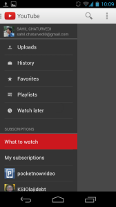
Difference in Navigation Drawers in Google Apps?

Google recently started adding a Navigation Drawers in most of it’s apps: This trend has started to catch on with many third-party app makers as well.

But there are some differences in these Navigation Drawers, and I wish Google would sort it out. It’s driving me crazy!

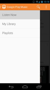
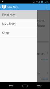
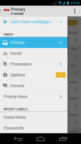
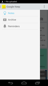
If you notice, even the sizes of the panes are different in each case! Very inconsistent.

What do YOU think? Let me know in the comments!

The "Google Play Apps" all look similar. But these buttons are very large compared to normal SlidingPanes.

The “Google Play” apps all look similar. But these buttons are very large compared to normal Navigation Drawers.

The "Google Play Apps" all look similar. But these buttons are very large compared to normal SlidingPanes.

The “Google Play Apps” all look similar. But these buttons are very large compared to normal Navigation Drawers.

This seems relatively consistent with Keep.

This seems relatively consistent with Keep.

This seems like the ideal size. But that white space is killing me. I can't think of another solution, though...

This seems like the ideal size. But that white space is killing me. I can’t think of another solution, though…

It looks consistent with the web version (thank god) but it feels too congested on Android.

It looks consistent with the web version (thank god) but it feels too congested on Android.